Insights / Branding

Logo design is normally the first thing a business owner would do to start a brand. Logos know your brand, they sum up your company’s personality, and they are often the first thing someone sees when interacting with your business.
However, do you know there are many types of logos in the market? Do you know what are them and which one is more suitable for your brand?
Read on to find out the 9 letter & image-based logos that you should know before contacting a designer or branding agency.
Letter-based Logos
1. Wordmark
A Wordmark logo is also known as a logotype. It is a straightforward type of logo with just the whole brand name shown in letter form. This means that there are no images, icons, mascots or symbols. While some brand owners might think that wordmark is dull and boring as it only consists of words, it is very versatile and timeless. Misinterpretation and miscommunication could be avoided too as the wordmark logo has already clearly represented and showcased the name of your business. Think of Samsung, Google, Coca Cola and Sony, for example.

2. Monogram
Similar to the wordmark, monogram aka letter mark, takes up an even simpler form of letter-based logos. Monogram only consists of the initials of the brand name. For instance, LV, LG, HBO, NASA and IBM to name a few. This type of logo is common and popular in businesses with long names. By using the initials, these brand logos will be easier to remember, recall and recognize. Truth be told, many consumers have become so used to these memorable acronyms that they have turned into the brand identity for the business. I mean, do you still remember the full name of NASA and HP?
They’re the National Aeronautics and Space Administration (NASA) and Hewlett-Packard (HP).

3. Letterform
Letterform is the shortest and most minimalist of all the letter-based logos as it only consists of one letter. They should be bold and well-design because it can be difficult to communicate with just a single letter logo. This type of logo can be risky to use for small businesses since you’ll need to achieve a level of brand recognition for consumers to comprehend your letterform logo. Some of the established brands that use letterform logos are McDonald's, Netflix, WordPress and Facebook.

Since letter-based logos consist of little to no design elements, the most important features that could make or break your logo are the colours and typeface. They are the ones responsible to make your brand stand out and distinguish itself from the competitors.
Typeface
“Words carry meaning; typefaces convey character.” - Michael Evamy
Determine the suitable typeface that communicates your brand personality is extremely crucial for business owners who choose to go for letter-based logos. The first thing to do when choosing a typeface is to figure out your brand personality and target audience. Here are some things to think about when deciding on your typeface:
- Font: Start by brainstorming adjectives that describe your business and find font families that convey them
- Weight: Thick or thin; solid or textured?
- Case: Uppercase or lowercase?
- Features: Shapes, curves, or notches?
- Spacing: Take into account the kerning (spaces between letters) and tracking (spaces of the overall wordmark) of your wordmark
Colour
Do you know that there are cultural meanings and psychological effects behind each and every colour?
Colour is what brings the text alive. Hence, you should use it to your brand’s benefit. Even with a clean typeface, a bold colour can help it stand out and attract attention. Alternatively, you could also play around by making one character different colour from the others, like Flickr. Do take note that your brand logo should have a number of colour variations to go with different colour backgrounds.
Image-based Logos
4. Logomark
Logomark comes in many names: brand mark, pictorial logo and logo symbol. All of them basically refer to the type of logo that you would first think of when mentioning ‘logo’. It is the image, icon, graphic or symbol that companies use to represent their brand.
As an example, Wolf Gelato uses the image of a wolf to represent their drive in dominating the healthy gelato industry.

5. Abstract Logomark
Different from logomark, abstract logomark is as the name suggests: a comparatively more abstract kind of logomark. It’s also an image or icon that symbolizes the brand, but instead of an obvious apple or bird, it requires more thinking. Abstract logomark commonly comes in a geometric form that infuses the brand story, purpose, personality and meaning of the business. It may be difficult to recognize, as it is usually built with unconventional shapes and elements, but it can help create a unique brand visual for your business to differentiate from your competitors. Think of Adidas, Nike or Pepsi.
To illustrate the point, take a look at 7 Thirty Coffee’s logo which beautifully encapsulates the brand message of an awake eye, the rising sun, a coffee cup and the clock hands pointing to 7:30.

6. Emblem
If you like logos with a vintage, old-school vibe, try emblem. It combines the letterings and images with design elements encapsulated within a border or frame. This is because it replicates the old time's rubber stamp into the wax seal, hence the restricted frame. An emblem carries the weight of tradition and history because it is often used by schools and organizations, like Harvard or Hogwarts.
Because of the emblem’s detailed design that entwined the symbols and words, it can be difficult to replicate on different mediums. Even so, the automobile industry is quite fond of this type of logo as it looks more professional and classic.

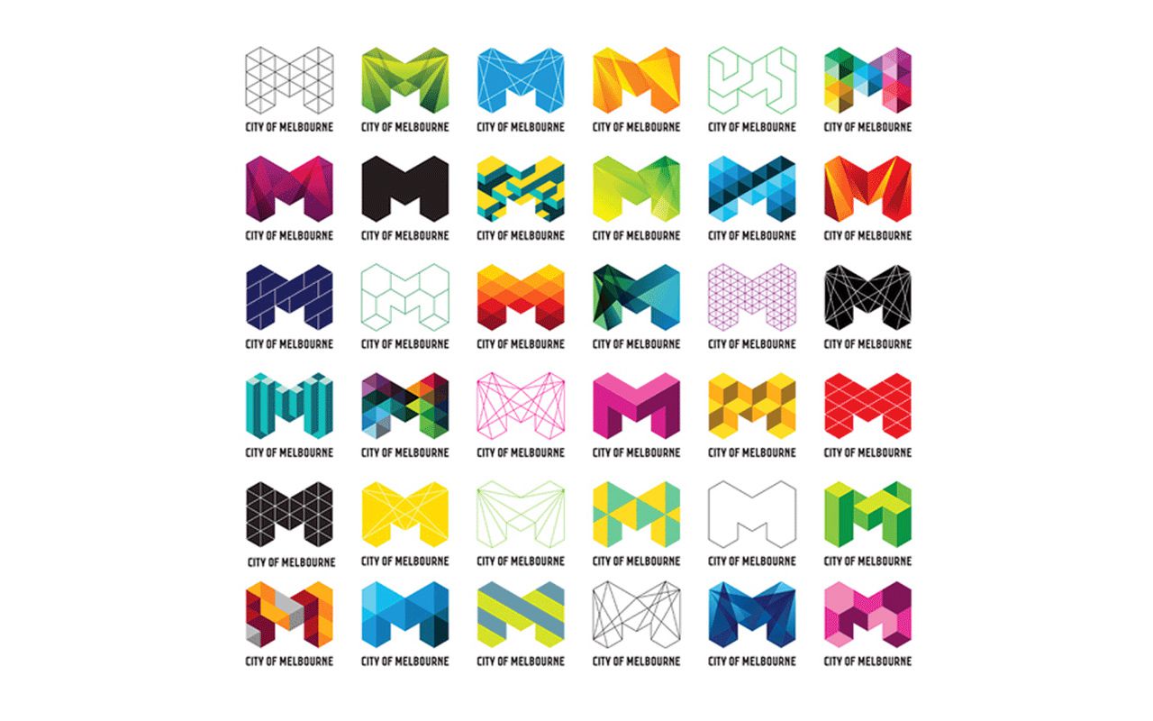
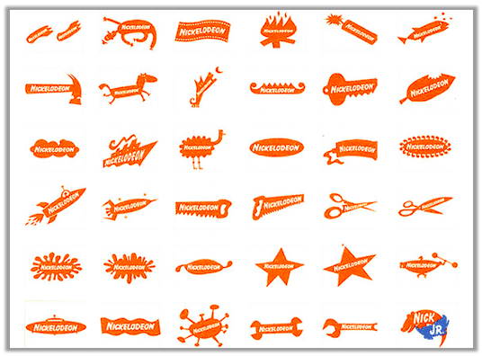
7. Dynamic Mark
Dynamic Mark goes with the name adaptable mark too. This type of logo is free to change its wording, shape and colours according to the context. It can be recreated for different marketing or branding purposes or occasions on various mediums. Thus, the dynamic mark could be considered the most versatile and adaptable logo of all kinds.
Some of the examples are Nickelodeon, MTV and the City of Melbourne.
8. Mascot
Mascot, as explanatory as it seems, is the illustrated character that acts as the face of your brand. In other words, a mascot is the ambassador of your brand. Since most of the mascots are in cartoon form, it is normally portrayed in a colourful, fun and happy way. Many brands use mascots to grab the children’s attention, thus, it is largely used for toys, food or any kid-related industry.

9. Combination Mark
A combination mark also consists of letter-based and image-based logos together. However, it is not restricted to a certain frame like an emblem. The letters and images could either be laid out side-by-side, stacked on top of each other or integrated together. Both the images or mascot and the text work hand in hand to reinforce the brand identity of your business as they create a distinct logo together. Consumers are also able to better recognize and relate to this kind of logo. As your business grows, you also have the option to exclude your brand name in the logo and leave only the icon. Just like Starbucks, the Siren has become an incredible icon that people don’t need the text to recognize the brand.

All in all, your brand logo shows how much thought you’ve put into the design to convey the brand message, personality and purpose you want to tell to the audience. Ultimately, it should be eye-catching, recognizable and good to look at. Nonetheless, don’t worry if you are unsure of how to put your ideas into designs, a branding agency is also helpful in this situation.


